Prom 2027 Colors: The Pantone Palette Guide
Every prom season starts somewhere you'd never expect, and this one starts on a runway in New York.
In September, Pantone released its New York Fashion Week color report for Spring/Summer 2027, and if you're planning a prom dress for spring 2027, that report is basically your preview. Spring/Summer 2027 is the exact window prom lives in. The colors designers are cutting fabric in right now are the colors that will be on the racks, in the rental catalogs and all over your feed by the time you're trying things on.
And honestly? It's a good one.
Why a runway palette matters for prom
Here's how it usually works. Pantone's color team reads what designers are showing, the fashion press repeats it, and fast-fashion and prom retailers react within months. By the time you search for dresses, the palette has already been baked into what's in stock.
That's not magic. It's just supply chains. If you want to dodge the "everyone showed up in the same color" moment, knowing the palette early gives you two options: ride the trend with a confident take, or deliberately step sideways from it.
Either choice is smarter than guessing.
Pantone NYFW Spring/Summer 2027
The Prom 2027 Palette at a Glance
Swatches are approximate on-screen colors. Always check fabric in person or in daylight photos before you buy.
The headline: this palette is bold on purpose
Pantone's executive director Leatrice Eiseman framed the season around colors that encourage individual expression and continuous experimentation. Read that as permission. The palette mixes high-heat reds and oranges with soft, almost botanical shades, so you can go big or go quiet and still be on trend.
Ten colors made the main list, plus five neutrals that are meant to work across seasons. Let's go through them the way you'd actually shop, grouped by mood.
The hot end: reds and oranges
This is the loudest part of the palette, and the one most likely to dominate prom photos.
Chili Pepper (Pantone 19-1557 TCX) is a dark, heated red. Think velvet, satin and anything with a sharp structured corset. It photographs richly and it's forgiving under dim gym lighting and ballroom uplights. If you've ever wanted a red dress that feels more evening than fire engine, this is the one. It also pairs naturally with the dark-and-dramatic energy in our top gothic prom dress trends for 2026.
Hibiscus (18-1762 TCX) is the drama sibling. Vivid, a touch cooler, and much more eye-catching than Chili Pepper. It's the color you pick when you want people to say "wait, who's that?" across the room. Pinks that lean red are already having a moment, which is why our pink homecoming dress guide is worth a read even if you're a spring prom person.
Dragon Fire (16-1460 TCX) is the most forceful shade in the group, a high-intensity orange. Most people will be afraid of it. That's exactly why it'll stand out. Try it in a flowy chiffon or a one-shoulder silhouette and keep the jewelry simple.
Langoustino (16-1440 TCX) is a warm coral pulled from the shell tone of the langoustine. It's the friendliest of the four, and the easiest to wear if orange feels like too much. Gold jewelry looks incredible against it.
Styling tip
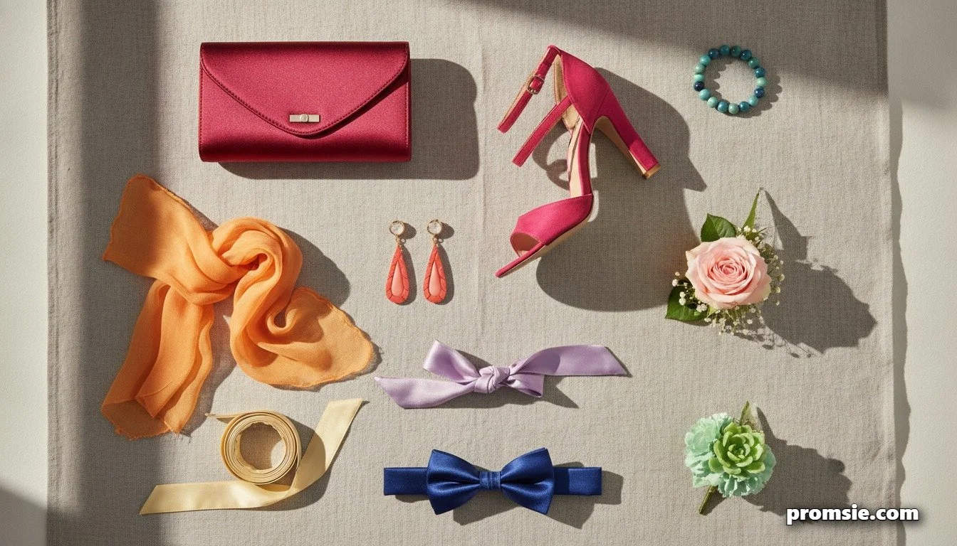
Warm shades like Dragon Fire and Langoustino look best with gold jewelry and soft, glowy makeup. Cooler reds like Hibiscus pair better with silver or pearl. When in doubt, keep the accessories simple and let the color do the talking.
The cool end: blues and greens
If red isn't your thing, there's a calm, confident side to this palette too.
Princess Blue (19-4150 TCX) is a deep, saturated blue that Pantone links to dignity and a regal bearing. Royal blue has been a prom staple forever, and this is its updated, richer version. It works in satin, taffeta and beaded fabrics, and it's one of the few colors that looks equally good on a gown and on a suit.
Waterfall (15-5516 TCX) is a mid-range blue-green that Pantone describes as energizing and mood-lifting. It sits somewhere between teal and seafoam, and it's perfect for beach, garden or outdoor prom themes.
Daiquiri Green (12-0435) is the wild card. A sharp, citrus-toned lime. On its own it's a statement. As an accent, on shoes, a clutch, a boutonniere or nails, it's an easy way to join the trend without committing your whole outfit.
The soft end: pale and pretty
Not everybody wants to be the loudest person in the room. Three shades in the palette have a quieter kind of impact.
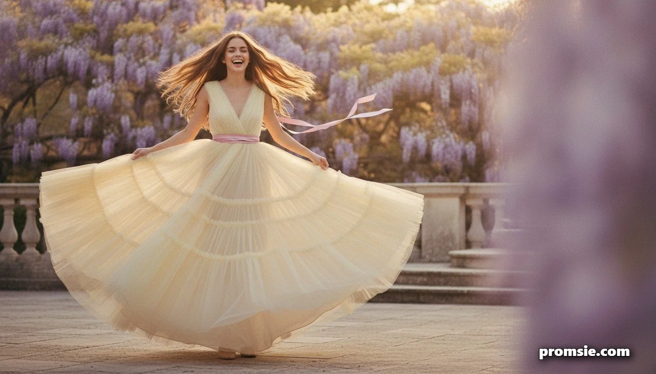
Anise Flower (12-0717 TCX) is a pale yellow named after a fine-leaved herb. Butter yellow has quietly been climbing for a while, and this is a polished version of it. Great in tulle and lace.
Rosy Future (15-1910 TCX) is a light, optimistic pink. It's soft but not sugary, which makes it a good choice if you love pink but don't want to look like a cupcake.
Lavender Oil (15-3615 TCX) is a softened lavender with green, herbal undertones. That slight green cast keeps it from feeling too sweet and makes it a lovely match for silver or pearl accessories.
The five neutrals nobody's talking about
The report also lists five neutrals designed to cross seasons: Antique White (11-0105 TCX), Tarragon (15-0326 TCX), Arrowwood (16-0954 TCX), Blue Indigo (19-3928 TCX) and Dolphin (16-2901 TCX).
For prom, they matter more than they sound. Tarragon is an earthy green that reads as a grown-up alternative to emerald. Blue Indigo is a near-midnight shade that works as the safest formalwear color on the list. And Antique White is a softer alternative to stark white, which brings us to something worth knowing.
A quick lesson from the last three Colors of the Year
Pantone names a Color of the Year every December, and the last few picks tell you a lot about how that announcement tends to land on prom racks.
For 2026 it was Cloud Dancer, a soft white. For 2025 it was Mocha Mousse, a warm brown, and for 2024 it was Peach Fuzz. Notice anything? The headline color is often gentle, almost neutral. The actual runway palettes are far louder. That gap matters, because prom dresses tend to chase the loud palette, not the single headline pick.
So when Pantone reveals its 2027 pick in December, expect the internet to react in one big wave.
Pantone Color of the Year 2027
Pantone hasn't announced its 2027 pick yet. It usually lands in early December, and we'll update this box the same day with what it means for prom dresses, suits and accessories.
How to pick your color without losing your mind
Start with the dress, not the trend. Browse our ultimate prom dress guide first to figure out silhouette and fit, then let the palette decide the shade.
If you're unsure, run this quick check:
Hold the fabric near your face in daylight. If your skin looks brighter, keep it. If it looks tired, move on.
Check it under warm indoor light too, since that's where you'll actually spend the night.
Look at it in a photo with flash. Dark reds and deep blues usually pass this test easily, while pale yellows can wash out.
Then think about how often you'll wear it again. A dress in Princess Blue or Blue Indigo has a second life at weddings and formals. Dragon Fire might not.
That brings us to money.
Trend colors and your budget
A trend color is usually most expensive in the first few months, when demand spikes and sizes sell out. If budget is tight, our breakdown of when to rent versus buy your dream dress is the place to start, and our look at the real economics behind prom will help you set a number before you fall in love with something out of reach.
Budget reality check
Get the look without paying the trend premium
- Buy a neutral dress and add one trend-color accessory.
- Consider renting if the color is a one-night statement.
- Shop earlier than you think, since trend colors sell out first.
- Set your number before you start browsing, not after you fall in love.
A smart middle path is to buy neutral and add the trend. A Blue Indigo or Antique White dress with Daiquiri Green shoes, a Hibiscus clutch or Dragon Fire nails gets you the look for a fraction of the price. For a deeper walkthrough on fit, sizing and alterations, the prom dress playbook has you covered.
For the guys: wearing the palette without looking like a color wheel
Suits don't need to match the dress exactly, and they shouldn't. What works is a single echo: a tie, a pocket square, a boutonniere or a vest in one of the palette's accent shades.
Blue Indigo and Princess Blue are the easiest suit colors on the list. Chili Pepper works beautifully as a vest or bowtie. Our guy's prom style report covers the cuts and fits that are in right now, and the prom planning guide for gentlemen covers the logistics most guys forget until the last week.
Matching your date without being matchy
Coordinating with a date is a negotiation, not an order. The simplest rule: one shared color, used in different places. If she's in Hibiscus, his boutonniere or pocket square picks up the same shade, and nothing else needs to match.
If you're still sorting out the who-brings-what part of the evening, our prom dating etiquette guide walks through the unwritten rules.
Date night
One shared shade is plenty
Pick a single color from the palette and use it in small ways: a boutonniere, a pocket square, a clutch, a corsage ribbon. Share the shade, not the whole outfit.
When to buy
Timing depends heavily on where you live, because prom dates vary a lot by state. Our state-by-state prom calendar will help you work backward from your date. As a general rule, trend colors move fastest, so if you're set on Dragon Fire or Hibiscus, shop earlier than you think you need to.
And if you're new to all of this, our explainer on what prom actually is is a good place to send a younger sibling or a friend who's never been.
What's coming next
The Pantone Color of the Year for 2027 is expected in December, and this article will be updated the day it's announced. Our big guide to promposals is also landing in December, and colors play a bigger part in asking someone than most people realize. Poster colors, flowers and even the outfit you ask in can all be matched to the season's palette. Keep an eye out for it.
Prom 2027 colors FAQ
What are the Pantone colors for spring 2027?
Pantone's New York Fashion Week report for Spring/Summer 2027 lists ten main colors:
Anise Flower, Princess Blue, Waterfall, Langoustino, Chili Pepper, Rosy Future, Dragon Fire, Daiquiri Green, Hibiscus and Lavender Oil.
It also lists five neutrals: Antique White, Tarragon, Arrowwood, Blue Indigo and Dolphin.
What is the Pantone Color of the Year for 2027?
It hasn't been announced yet. Pantone typically reveals its Color of the Year in early December. The 2026 pick, Cloud Dancer, was announced in early December 2025. This page will be updated when the 2027 color is revealed.
What color should I wear to prom in 2027?
There isn't one correct answer, which is the point of the palette. If you want a bold look, try Chili Pepper, Hibiscus or Princess Blue. If you prefer something softer, Rosy Future, Lavender Oil and Anise Flower are good options. For a dress you can wear again, Blue Indigo and Tarragon are safe, versatile picks.
Are bright colors okay for prom?
Yes. Pantone's SS27 palette leans bright, with intense reds, orange and a lime green. If a full bright dress feels like too much, wear a neutral dress and add one bright accessory such as shoes, a clutch or nails.
How do I match my prom date's outfit to my dress color?
Pick one shared shade and use it in a small way, such as a boutonniere, pocket square or tie. Matching one accent looks intentional, while matching everything usually looks forced.
How early should I buy a trend-color prom dress?
Earlier than you'd think. Trend colors tend to sell out first, and sizes disappear quickly. Check your school's prom date, work backward, and give yourself time for alterations.
Can I rent a prom dress in a trend color?
Often, yes, and it can save a lot of money. Our guide on renting versus buying walks through when each option makes sense.
Sources
Pantone NYFW Spring/Summer 2027 color trend report: the top 10 colors (FashionUnited)
Pantone selects Cloud Dancer as its Color of the Year for 2026
Predictions for the 2026 Pantone colour of the year (OCAD University)
<script type="application/ld+json">
{
  "@context": "https://schema.org",
  "@type": "FAQPage",
  "mainEntity": [
    {
      "@type": "Question",
      "name": "What are the Pantone colors for spring 2027?",
      "acceptedAnswer": {
        "@type": "Answer",
        "text": "Pantone's New York Fashion Week report for Spring/Summer 2027 lists ten main colors: Anise Flower, Princess Blue, Waterfall, Langoustino, Chili Pepper, Rosy Future, Dragon Fire, Daiquiri Green, Hibiscus and Lavender Oil. It also lists five neutrals: Antique White, Tarragon, Arrowwood, Blue Indigo and Dolphin."
      }
    },
    {
      "@type": "Question",
      "name": "What is the Pantone Color of the Year for 2027?",
      "acceptedAnswer": {
        "@type": "Answer",
        "text": "It hasn't been announced yet. Pantone typically reveals its Color of the Year in early December. The 2026 pick, Cloud Dancer, was announced in early December 2025. This page will be updated when the 2027 color is revealed."
      }
    },
    {
      "@type": "Question",
      "name": "What color should I wear to prom in 2027?",
      "acceptedAnswer": {
        "@type": "Answer",
        "text": "There isn't one correct answer, which is the point of the palette. If you want a bold look, try Chili Pepper, Hibiscus or Princess Blue. If you prefer something softer, Rosy Future, Lavender Oil and Anise Flower are good options. For a dress you can wear again, Blue Indigo and Tarragon are safe, versatile picks."
      }
    },
    {
      "@type": "Question",
      "name": "Are bright colors okay for prom?",
      "acceptedAnswer": {
        "@type": "Answer",
        "text": "Yes. Pantone's SS27 palette leans bright, with intense reds, orange and a lime green. If a full bright dress feels like too much, wear a neutral dress and add one bright accessory such as shoes, a clutch or nails."
      }
    },
    {
      "@type": "Question",
      "name": "How do I match my prom date's outfit to my dress color?",
      "acceptedAnswer": {
        "@type": "Answer",
        "text": "Pick one shared shade and use it in a small way, such as a boutonniere, pocket square or tie. Matching one accent looks intentional, while matching everything usually looks forced."
      }
    },
    {
      "@type": "Question",
      "name": "How early should I buy a trend-color prom dress?",
      "acceptedAnswer": {
        "@type": "Answer",
        "text": "Earlier than you'd think. Trend colors tend to sell out first, and sizes disappear quickly. Check your school's prom date, work backward, and give yourself time for alterations."
      }
    },
    {
      "@type": "Question",
      "name": "Can I rent a prom dress in a trend color?",
      "acceptedAnswer": {
        "@type": "Answer",
        "text": "Often, yes, and it can save a lot of money. Our guide on renting versus buying walks through when each option makes sense."
      }
    }
  ]
}
</script>